Scroll Progress Percentage
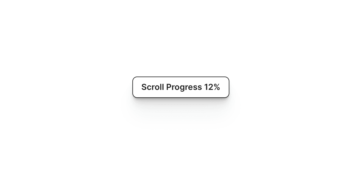
The Framer Scroll Progress Percentage component showcases the user's scrolling progress on the current page.
The Framer Scroll Progress Percentage component provides a visual representation of the user's scrolling progress on the current page.
To implement the Scroll Progress Percentage component, follow these steps:
Drag and drop the "Scroll Progress Percentage" component from the component list onto your canvas.
Configure the following properties:
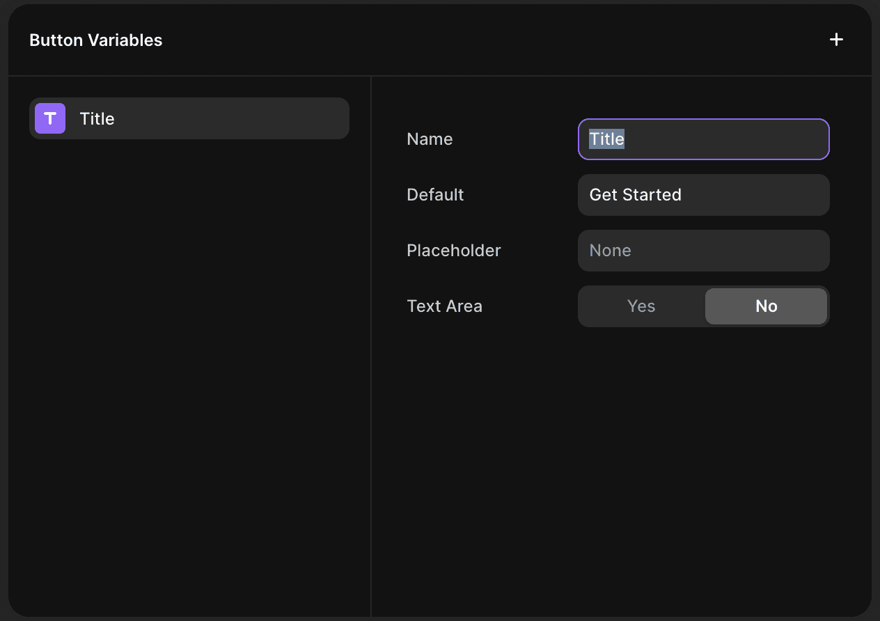
Button: Select the component on your canvas that you want to display the scroll progress percentage. This component should be outside the Desktop, Tablet, and Mobile breakpoints
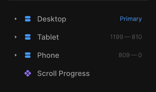
and it should have a "Title" property.
Fraction Digits: Specify the number of decimal places to include in the displayed percentage value.
Prefix: Enter any text or symbols you want to appear before the percentage value.
Suffix: Enter any text or symbols you want to appear after the percentage value.
Transition: Choose the desired animation style for the progress percentage effect from the available Framer transitions.
With these settings, the Scroll Progress Percentage component will dynamically update and display the user's scrolling progress on the current page.
More Components
Social Media Share Buttons
The Framer Social Media Share Buttons let you share your page on platforms like Twitter, LinkedIn, Instagram, Facebook, Pinterest, WhatsApp, and Reddit.
Download Button
Streamline file sharing with Framer's Download Button component, allowing you to create downloadable resources for any element.
Before and After Image Slider
The Framer Before and After component slider allows you to compare two images side by side by sliding to reveal or hide parts of each.
Stop Scroll
The Framer Stop Scroll component temporarily disables scrolling, perfect for preloaders or blocking interactions during events.
Scroll to Top Button
The Framer Scroll to Top Button component allows you to add a button to your website that, when clicked, will smoothly scroll the page back to the top.
Tags
The Framer Tags component allows you to display a list of tags. This component is useful for displaying categories, highlighting keywords, showcasing topics...
Let's take it to the next level.