Text Scroll Reveal
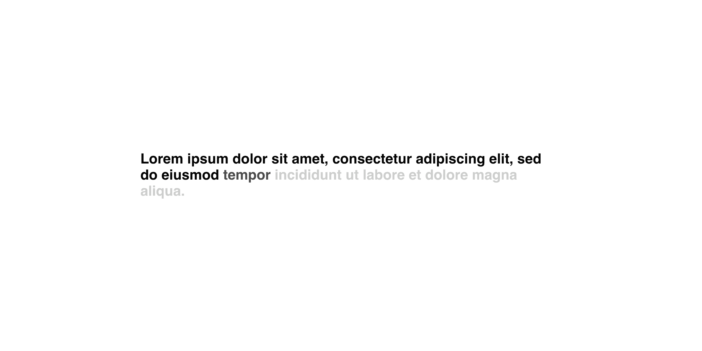
The Framer Text Scroll Reveal component allows you to create text reveal animation triggered by scroll position.
To implement the Text Scroll Reveal component, follow these steps:
Drag and drop the "Text Scroll Reveal" component from the component list onto your canvas.
Configure the following properties:
Text: Enter the text content that you want to reveal during the scroll animation.
Tag: Select the HTML tag for the text element (e.g., h1, h2, h3, span, p).
Type: Choose whether you want the reveal animation to occur word-by-word or character-by-character.
Font: Customize the font properties, including family, size, weight, and style.
Color: Set the color of the text.
Max Opacity: Specify the maximum opacity value for the text when fully revealed (between 0 and 1).
Min Opacity: Set the minimum opacity value for the text before it starts revealing (between 0 and 1).
Start: Determine the scroll position where the text reveal animation should start (Bottom, Bottom/Center, or Center).
End: Select the scroll position where the text reveal animation should end (Top, Top/Center, or Center).
Transition: Choose the desired animation style for the text reveal effect from the available Framer transitions.
With these settings, the Text Scroll Reveal component will dynamically reveal your text content as the user scrolls.
More Components
Social Media Share Buttons
The Framer Social Media Share Buttons let you share your page on platforms like Twitter, LinkedIn, Instagram, Facebook, Pinterest, WhatsApp, and Reddit.
Download Button
Streamline file sharing with Framer's Download Button component, allowing you to create downloadable resources for any element.
Before and After Image Slider
The Framer Before and After component slider allows you to compare two images side by side by sliding to reveal or hide parts of each.
Scroll Progress Percentage
The Framer Scroll Progress Percentage component showcases the user's scrolling progress on the current page.
Stop Scroll
The Framer Stop Scroll component temporarily disables scrolling, perfect for preloaders or blocking interactions during events.
Scroll to Top Button
The Framer Scroll to Top Button component allows you to add a button to your website that, when clicked, will smoothly scroll the page back to the top.
Let's take it to the next level.