How to use Dynamic Viewports and Relative Units in Framer
Learn How to use Dynamic Viewport units (svh, lvh, dvh) and relative units (vh, vw, vmax, vmin, em, rem) in Framer projects.

9 min read
·
Sep 30, 2024
In this tutorial, you'll learn how to use Dynamic Viewport units (svh, lvh, dvh) and relative units (em, rem) in Framer projects.
Currently, Framer doesn't natively support these dynamic sizing options. However, in this guide, I will show you a workaround to implement them in your projects.
You can track the progress of these features by following the Dynamic Viewports and Additional Sizing Options feature requests
Why use Dynamic Viewport Units?
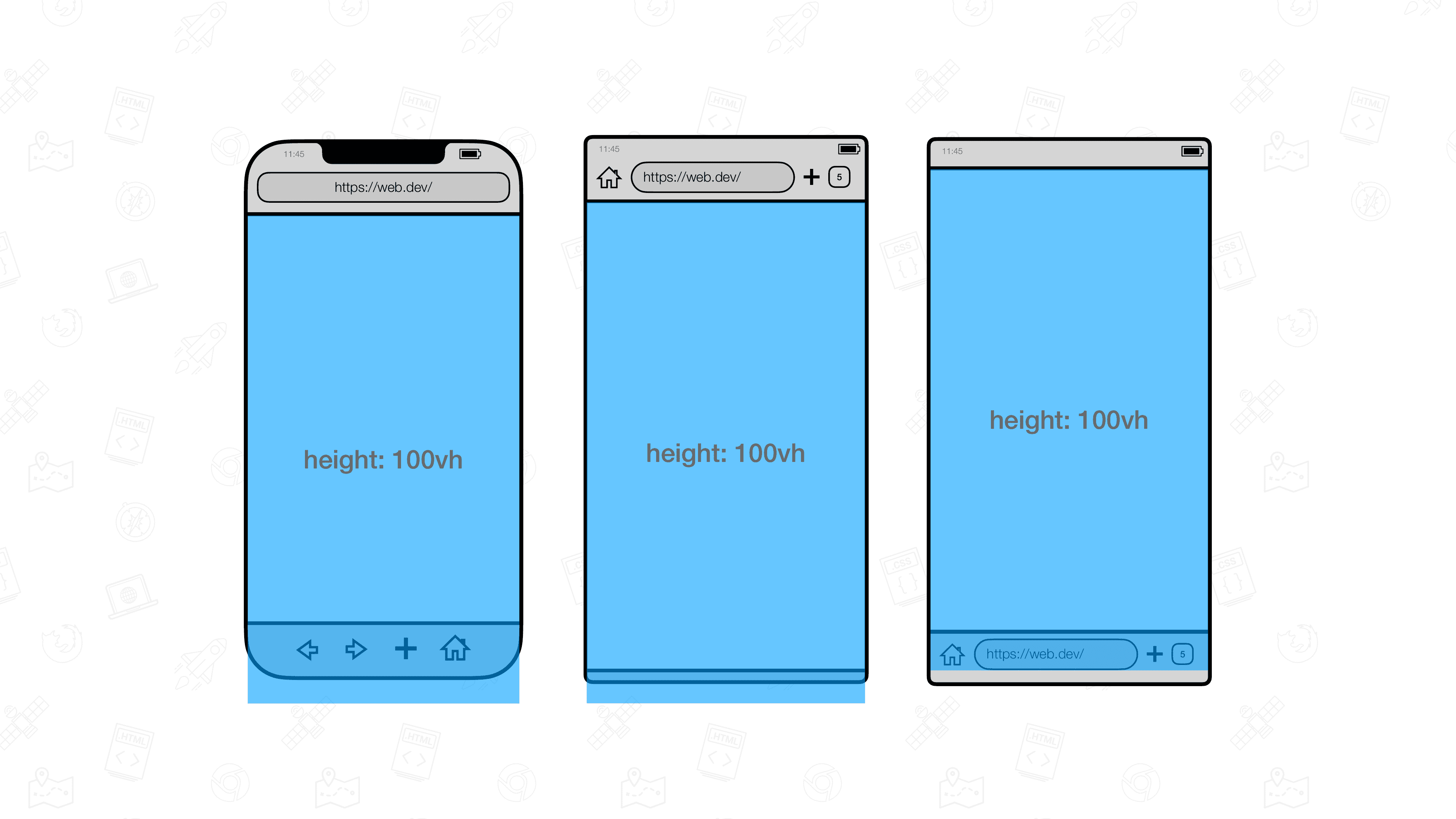
Dynamic viewport units help solve a common problem on mobile devices. On phones and tablets, the visible area (viewport) can change when toolbars appear or disappear. Regular units like vh (viewport height) don't adjust for these changes, which can cause issues:
When you use
100vhfor an element's height, it might be too tall when toolbars are showing, extending beyond the screen.This same
100vhelement only fits perfectly when all toolbars are hidden.
To solve this, new viewport units were introduced:
lv*: Large viewport (assuming retracted toolbars)sv*: Small viewport (assuming expanded toolbars)dv*: Dynamic viewport (adapts to toolbar state)
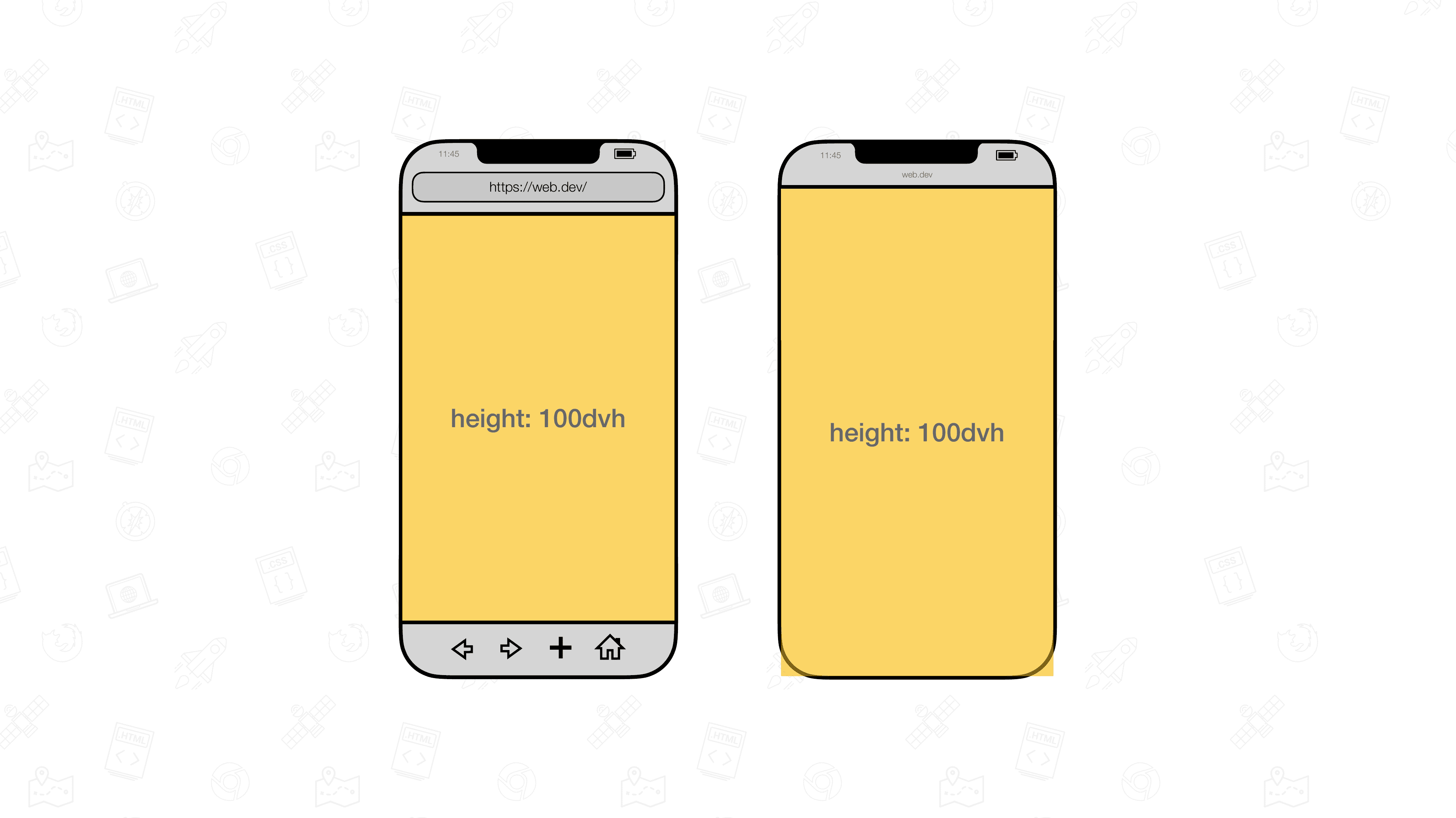
Dynamic viewport units were created to automatically adjust to these toolbar changes, ensuring your layouts look good in all situations.
For more details and examples, visit web.dev.
How to use Dynamic Viewport Units and Relative Units in Framer
To implement Dynamic Viewport and Relative units in your Framer project, follow these steps:
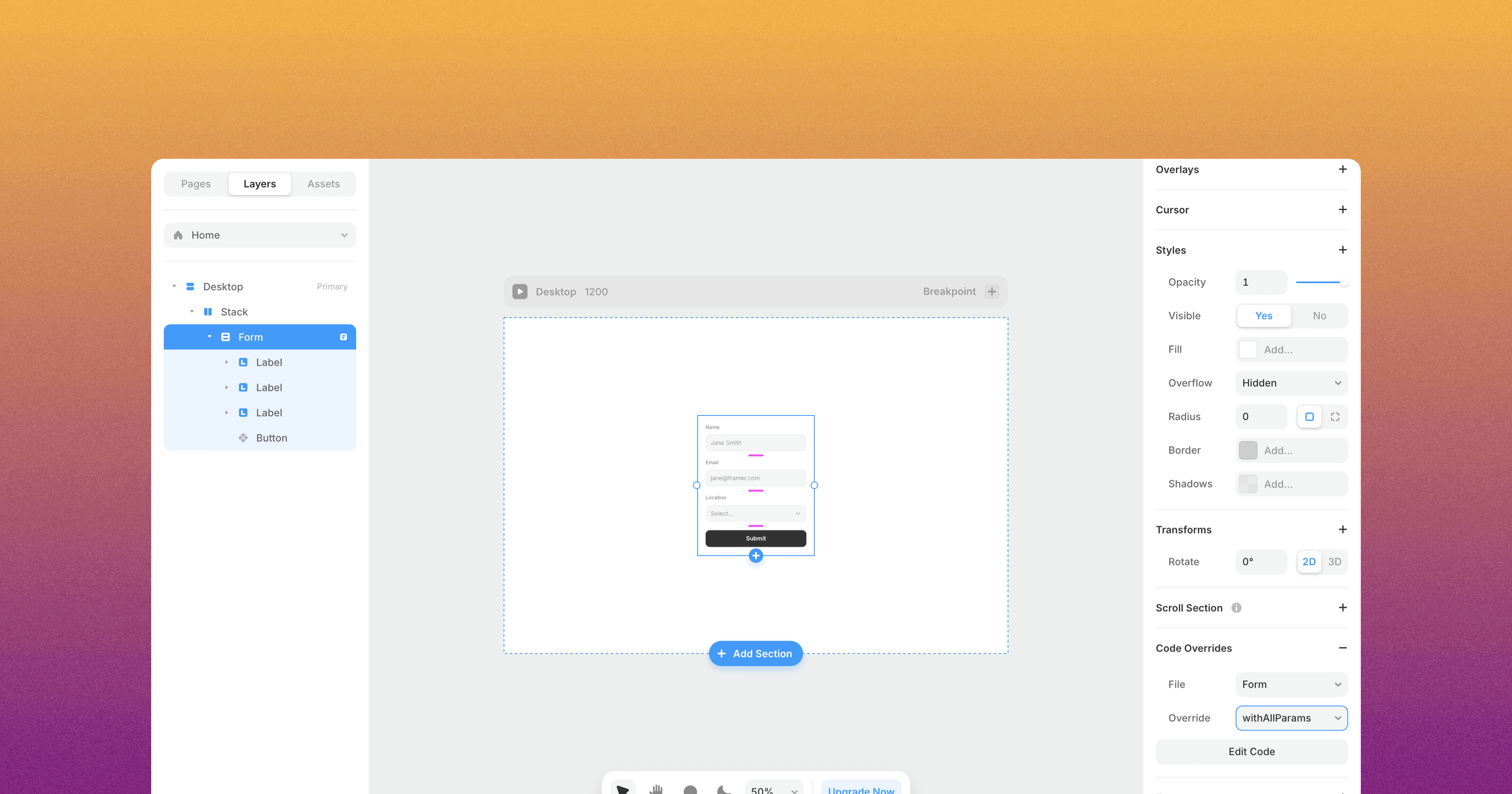
Open the remix link associated with this article to access the custom code override.
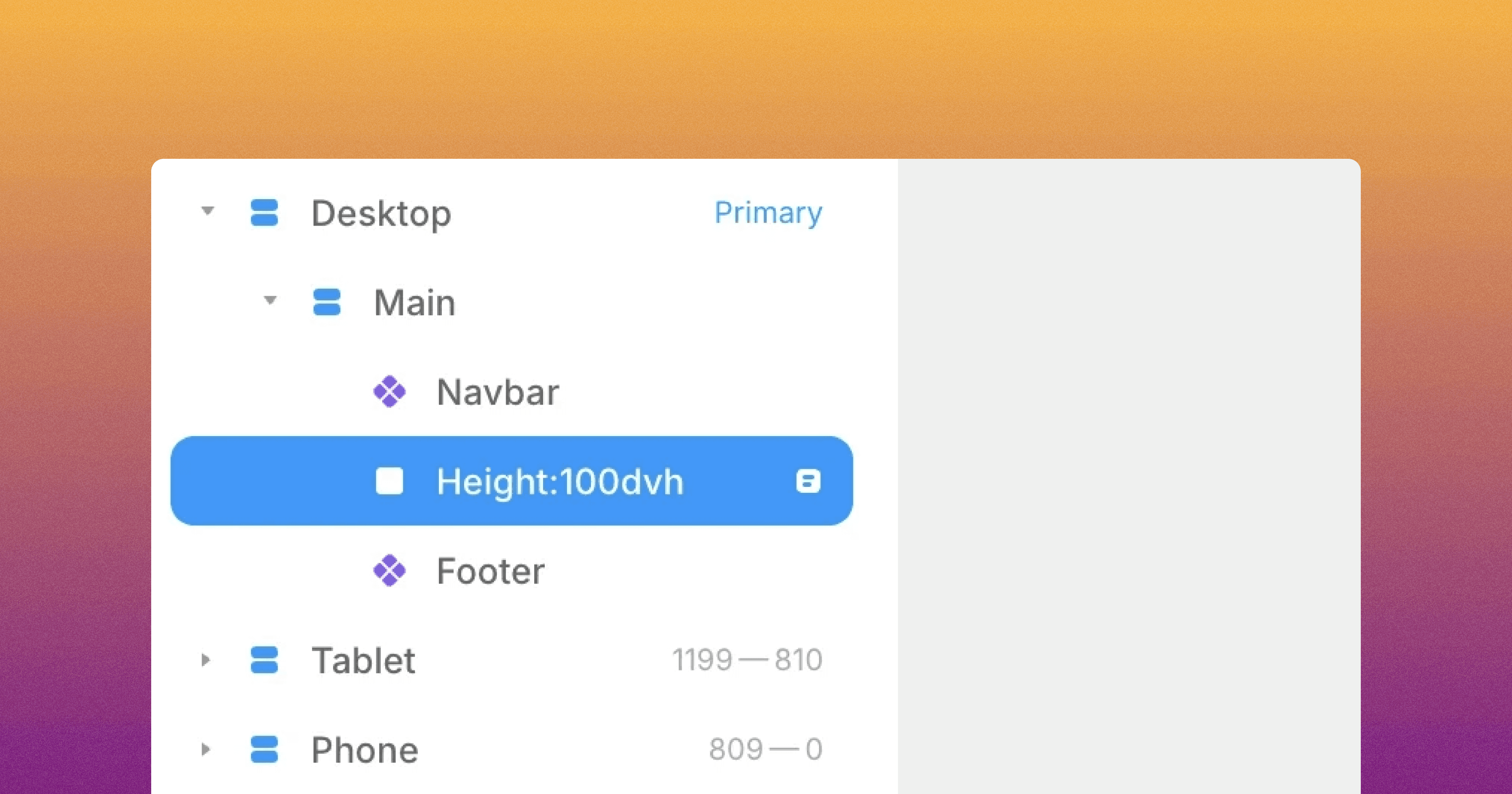
In your Framer project, create a new custom code override named
DynamicAndRelativeUnits.tsx.Copy the code from the remixed project into your
DynamicAndRelativeUnits.tsxfile.The code override contains a function called
withDynamicAndRelativeUnits. You'll need to apply this function to any element you want to size using Dynamic Viewport and Relative units.After applying the
withDynamicAndRelativeUnitsfunction to an element, rename the element to specify its size using the following format:For height only:
height:[value][unit]For width only:
width:[value][unit]For both height and width:
height:[value][unit]|width:[value][unit]
Examples:
To set a stack's height to 100dvh, rename it to "height:100dvh"
To set an element's width to 50rem, rename it to "width:50rem"
To set both height and width, use "height:100dvh|width:50vw"

Preview your page to see the new sizes in action.
You can use various units this way, including:
Dynamic viewport units: dvh, dvw, dvmin, dvmax
Small viewport units: svh, svw, svmin, svmax
Large viewport units: lvh, lvw, lvmin, lvmax
Relative units: rem, em
And voilà, by following these steps, you can now utilize Dynamic Viewport units and other relative units in your Framer project!
Don't forget to share this post!